
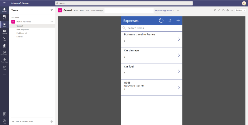
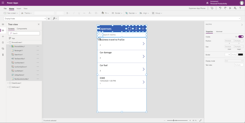
Power Apps created with a phone layout are very small when you open them in Teams, on a tablet or on your desktop.
Microsoft is working on a container control to build responsive Power Apps but this is still experimental while I’m writing this blogpost. After the experimental phase, it will go to the preview phase and can be used in new Power Apps.
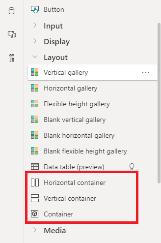
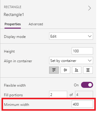
The (horizontal and vertical) container control is something very nice and allows objects to dynamically jump on the screen depending on the screen size. For each object, you can define a minimum width.
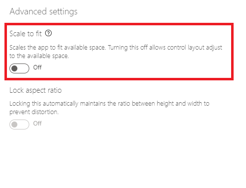
To experiment with responsive Power Apps you need to turn “Scale to fit” off in the “Screen size + orientation” settings. “Lock aspect ratio” automatically turns off when you turn the first one off.
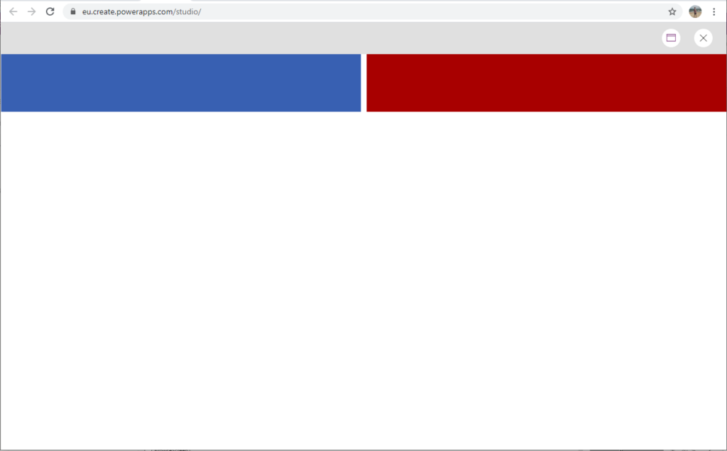
In the screenshot below, we have a container control with two rectangles in it. They both have a minimum width of 400.
With a screen size of a tablet, the two rectangle shapes are next to each other because they can both have their minimum width of 400.
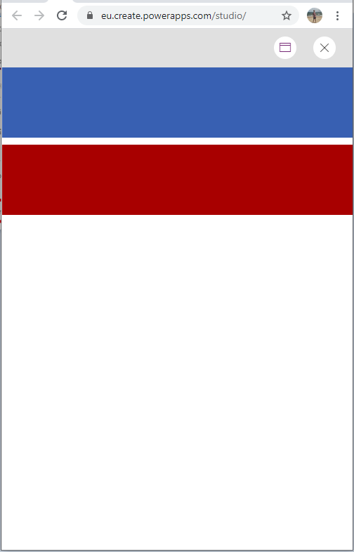
When the screen becomes too small, for example if we open the app on a smartphone, the red rectangle jumps below the blue one because both cannot have a 400 width anymore when they are next to each other.
In the Power Apps documentation, there is already an article about creating responsive layouts in Power Apps. In that article there is not yet a lot of information about the experimental container control.
Back to our Power App with Phone layout. As you can see in the screenshot, a lot of space is lost. We can convert our phone layout to a tablet layout. In this blogpost, we will discuss a manual and automatic way to convert your app.
Manually converting a phone layout Power app to a tablet layout
Create a blank tablet layout Power App.
Manually add the data source to it.
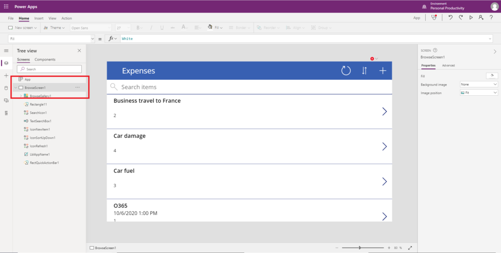
Copy everything from the first screen and paste it in to the tablet app.
Change the screen name from “Screen1” to “BrowseScreen1”.
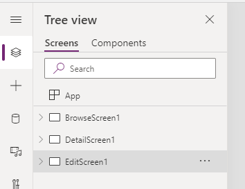
Create two new screens “DetailScreen1” and “EditScreen1”.
Copy the content of the screens in the phone layout Power App to the tablet layout Power App as we did for “BrowseScreen1”.
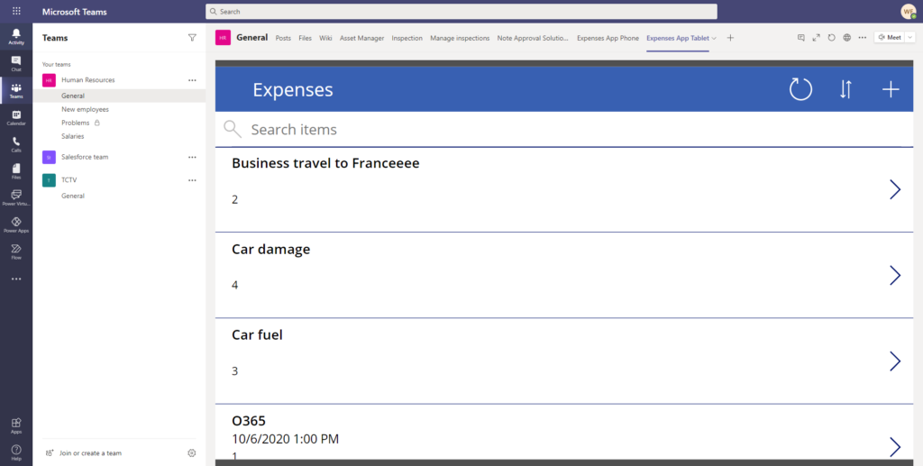
Save and publish your new app, add it to Teams and it will be the same one as your Phone layout Power App but larger.
You can still change the font sizes or adapt it to fit better on the screen. Adding extra information in the galleries or elsewhere is also possible.
Phone to Tablet Layout Converter

On Github, you can find a Phone to Tablet Layout Converter.
These tools are non-official and are not supported yet.
You can also find a:
This article seems incomplete. The example with the rectangles doesn’t really seem to work for me, so I suspect there’s something you didn’t explain that I must be missing.